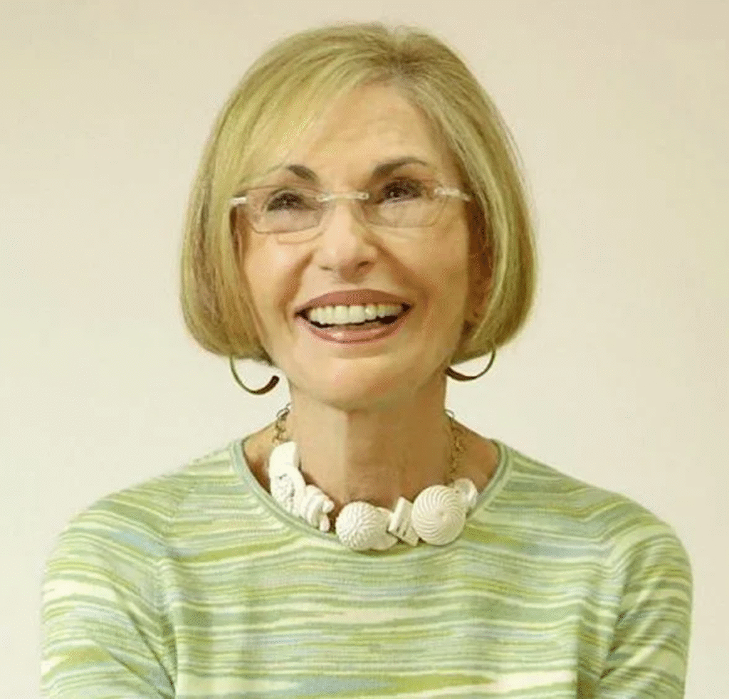
She has been called “the international color guru” whose career spans over 30 years. The author of 10 books – all about colors – travels around the world giving presentations on color trends and forecasts, and other color-related information. She is an influencer that the media reach out to for her expertise on the subject.
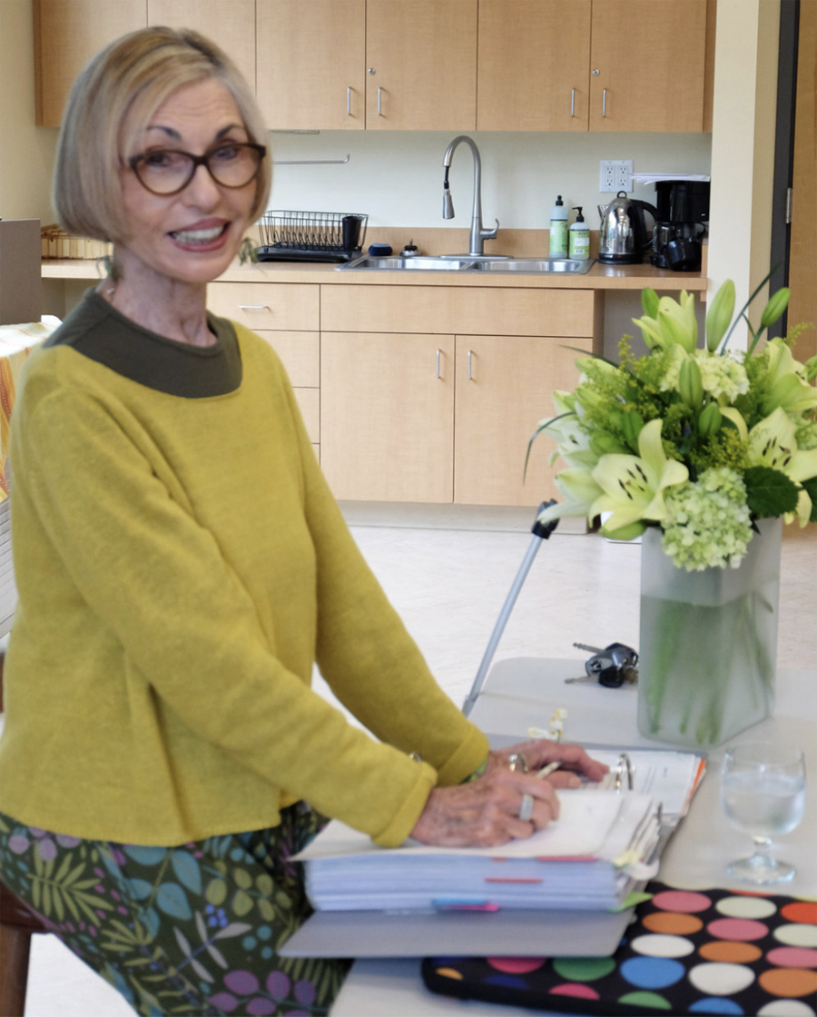
Leatrice “Lee” Eisemann is fluent in the language of colors.
“I don’t ever remember a time when color wasn’t important to me. When I was a teen my mom gave me free rein in my bedroom. I chose an Asian-influenced room with red walls and an enameled black desk. I’ve never been curtailed from the use of color. I’ve only been encouraged,” she says.
“When I was a little girl, I’d come home from school and my mother would have completely re-painted the interior of our Baltimore rowhouse. It was an annual spring ritual.”
Lee heads the Eiseman Center for Color Information and Training and is also executive director of the Pantone Color Institute.
The American colors specialist says clients who come to her often need color validation. “I help them make decisions about their product color choices. Color is not just ‘let’s throw the darts at the Pantone charts and see where it lands.’ It requires research and it’s based on a lot of criteria, not the least of which is knowing your target audience and their lifestyle.”
She has traveled to many parts of Asia, Europe, the Middle East, Australia, Latin America, the U.S. and Canada giving talks to schools, businesses, trade shows and museums. “I am always intrigued to visit parts of Asia and love invitations from that part of the world. There is so much to see and experience.”
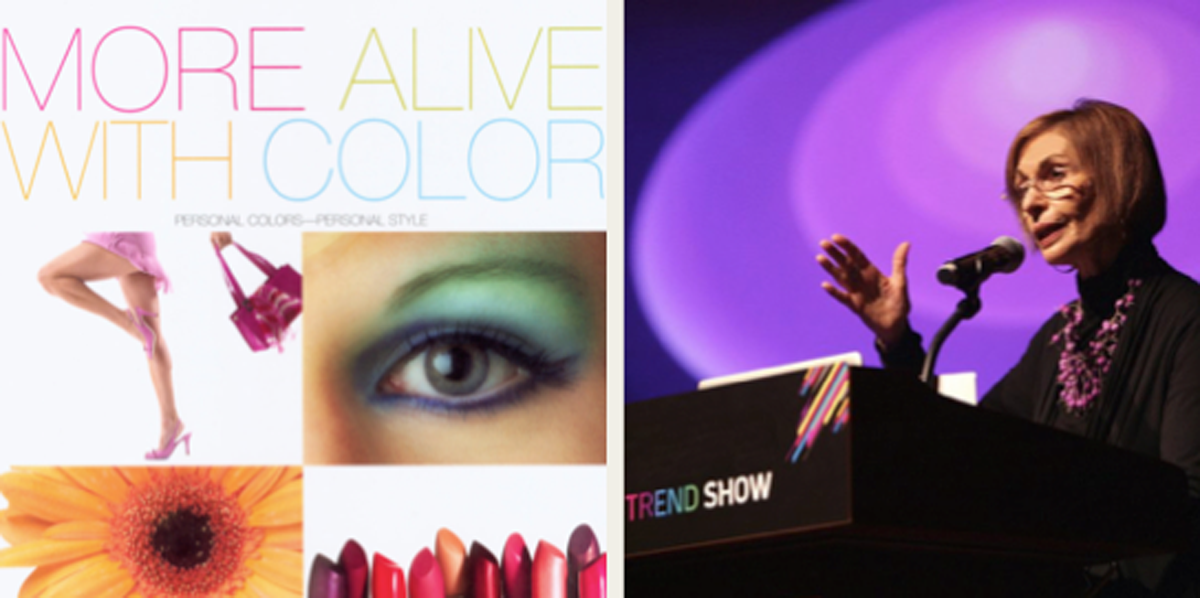
Lee has helped many companies to make the best and most educated choice of color for product development, brand imaging, interior/exterior design, fashion and cosmetics, or any other application where color choice is invaluable to the success of the product or environment.
“The power that color wields is seen at every level of communication: in corporate identification, packaging, signage, advertising on television, billboards, in print media, on the computer, at point of purchase and in the product itself. Color is often called the ‘silent salesperson’ and in many cases must immediately create a brand identity and, most importantly, help to make the sale. At the very least (as on a web page or in a print ad) it must create enough interest or curiosity to induce the would-be buyer to find out more about the product or service,” Lee writes in her book The Pantone® Guide to Communicating with Color. She names “Mimosa, Brandied Melon, Grenadine, Tiger-Lily, Radiant Orchid and, of course, jewel tones: Garnet, Emerald” among her Pantone favorite colors.
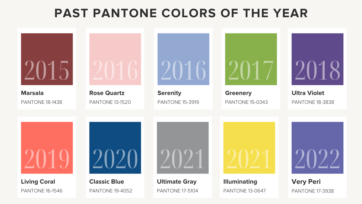
Lee is responsible for selecting Pantone’s “Color of the Year” which influences everything from fashion to floral, furniture to phone cases – essentially giving the whole world an annual color overhaul.
Back in the 1980s, the man who started Pantone, Lawrence Herbert, began to think about the psychology of color: ‘Why do people choose a color?’ ‘What does that color mean?’ Someone gave him a copy of Lee’s first book at the same time he was looking for an executive director for the Pantone Color Institute.
Lee remembers when Pantone’s annual Color of the Year started 23 years ago. “Back in 1999 we were all worried about ‘Y2K’ and whether our computers would crash. We chose a color for 2000 that would personify the future: a millennial blue because it was inviting, hopeful, clean and enduring. We wanted to embrace the idea of the steadfast, constant sky.”
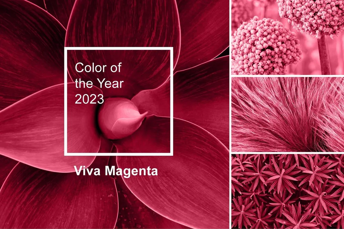
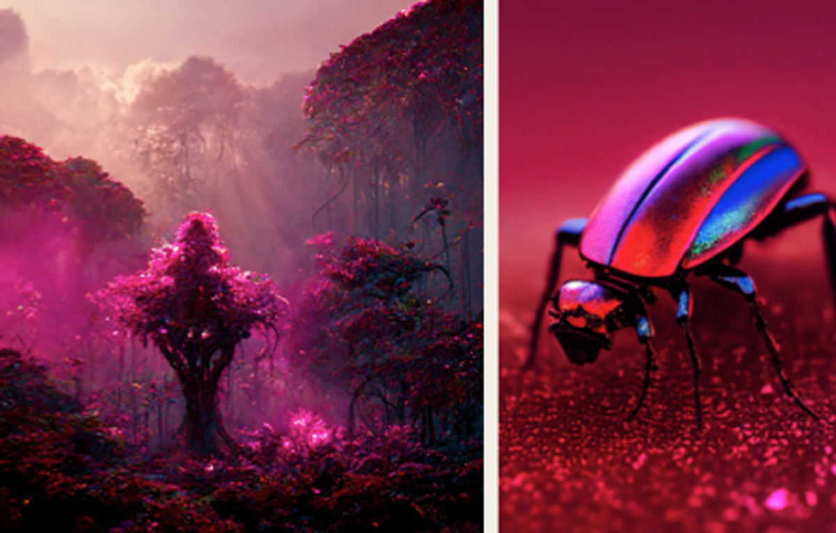
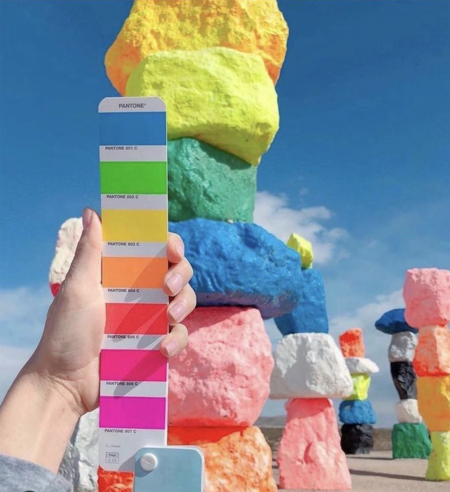
Pantone’s Color of the Year (2023), Viva Magenta 18-1750, vibrates with vim and vigor. It is a shade rooted in nature descending from the red family and expressive of a new signal of strength. Viva Magenta is brave and fearless, and a pulsating color whose exuberance promotes a joyous and optimistic celebration, writing a new narrative.
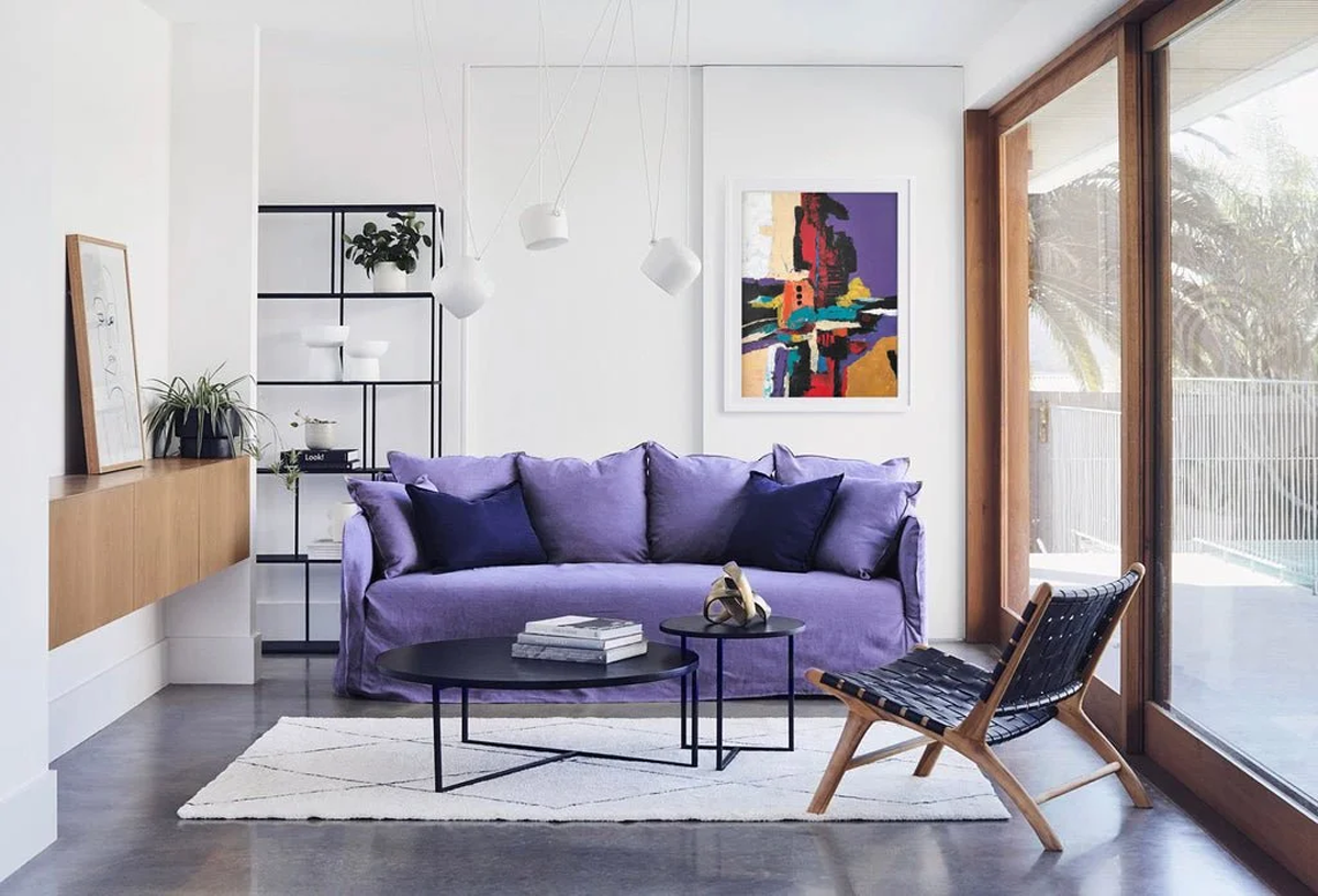
Color within the business, retail or personal environment is a critical factor in creating mood, image and a productive atmosphere that elicits a positive, favorable response.
I couldn’t agree more with Lee. After all, color is everywhere. The psychology of color runs deep.
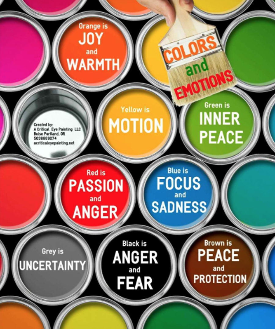
Colors trigger emotions. Some escape to the beach or the mountains when feeling stressed, and almost instantly a sense of calm seeps in. There are days when some feel like wearing something red, yellow or orange to banish melancholia.
Colors provide a glimpse on cultures. In most countries in Asia, red symbolizes power, prosperity, fertility, celebration as well as drives away evil spirits. In Western cultures, red denotes passion, love, excitement, warning, danger, stop, hot, spicy.
Certain idioms are expressed in color such as seeing red, green with envy, gray area, feeling blue, white lie, black sheep, yellow streak and tickled pink.
In art therapy patients are encouraged to use color to help them express some of the deeper parts of their psyche. It is also believed that color choices can reveal personality traits (blue for introverts and red for extroverts).
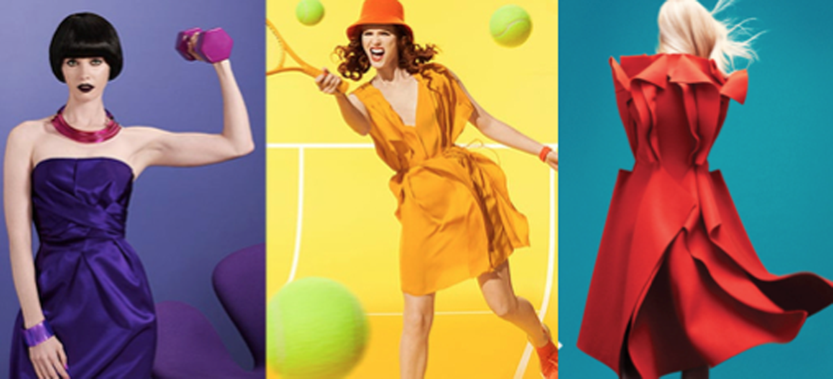
Fashion houses’ latest creations are designed according to seasonal colors. Shades of yellow, pink, blue, orange and green bloom onstage for spring-summer collections. Tones of red, brown, gray and black are often seen for autumn-winter collections.
I remember a neighbor in Hong Kong casually remarked that I am “an autumn person”. I found out that she was a colorist consultant. Intrigued, I asked her to tell me more. Needless to say, I went back to our flat and immediately checked my closet. It was full of brown, blue and black clothes and accessories – confirming that I am an autumn person.
My fascination with colors was re-awakened when I came across a Travel+Leisure article in January this year. The headline “Pantone’s 2023 Color of the Year Is An Unsuspecting Traveler’s Dream — Here’s Where You Can See It Around the World ” was enough to get my attention. It nudged me to look deeper into the psychology of color. My research led me to Lee, who shared more insights.
How color helps achieve balance in our lives. Seeking equilibrium is a natural human longing, whether it be physically, spiritually, aesthetically, or emotionally. The ancient Chinese were very aware of this need, one they called the balance of yin and yang. In more scientific terms, this balanced state of ease, as opposed to dis-ease, is referred to ashomeostasis. Interestingly, these amazing bodies that we inhabit contain a mechanism that always provides an instant visual balance.
For example, if you studied color in school you probably had a teacher who introduced you to a fun and fascinating experiment. Concentrate on any color surface for a few seconds, then look away at another plain surface, preferably white, and you will see what is called the after-image. This is actually the complementary color opposite to the color you were concentrating on. This phenomenon is a graphic example of the body’s ability to provide instantaneous restoration of balance through color.
When a cool color is viewed, the after-image will always be a warm color. Conversely, a warm color will always be balanced with a cool after-image.
Rules of color to follow
Keep an open mind. There are so many urban legends that fly around the internet that I try to dispel the old rules about what-goes-with-what. If you have a favorite color, you can find a way to make it work.
Decorating your home
Don’t worry about what other people think. Let your heart speak and don’t be deterred. Let the artist in you come out. If you need some validation, go to a professional who can give you unemotional and honest advice and guidance.
Color palette and sweet palate
It’s all about pleasure. Starting way back in your infancy, to your earliest reaction to color and taste, it is invariably the sweet confectionery colors that are always thought of as not only sweet to the taste buds, but to the eye as well. Think of your first bit of birthday cake with sugary sweet pure white, bubble-gum pink, delicate lavender, lemon-drop yellow, or baby blue icing. Think yellow Necco wafers. Think of a chocolate ice cream cone dripping down on your clean white shirt and leaving a sticky residue gluing your fingers together. Think of hot fudge sundaes with whipped cream and a cherry on top. Recall sugary spun pink cotton candy at the carnival or red dots sticking to your teeth and delighting you with their spiciness. If you can’t remember back that far, observe any baby as it dives to stuff sweet stuff into its little mouth, and you can see that the reaction is almost invariably pure joy.
When you were older, unless you are the rare exception, this translated into more sophisticated tastes, but no less sweet and suggestive of your earliest pleasurable memories. Think of purple smoothies and raspberry sherbets, pastel petit fours, delectable fudge caramel ice cream, creamy gelatos, lattes with mocha, and decadent seven-layer chocolate cake. Think blueberry tarts and crème fraise, mint chocolate, and banana cream pies. How about strawberry daiquiris and peach melba? Get the picture (and the colors in those images)?
If you are not already salivating, a look at the “real thing”, in the colors mentioned above, will immediately elicit the taste of sweet and luscious goodies, just as they did with your first realization that sweet tastes in all of those enticing colors were extremely pleasurable. And it is just these memories that make it so difficult to resist the temptation especially when there are so many colorful enticements that beckon from the supermarket shelf, the bakery, ads, commercials, and not least of all the neighborhood Starbucks or Baskin Robbins!
On her personal favorite colors
That’s like asking which is my favorite child… It has changed over the years but I find myself attracted to the purple family. I love the complexity of purple. It has two sides to it that are seemingly diametrically opposed: the sensual, exciting, adrenalin-popping red side of purple and the meditative, quiet, Zen, blue-purple.

For those aspiring to be a color specialist
Create or expand a career in color. Although you might naturally have a good sense of color or are currently working in a career that involves the use of color, there is always more to learn that will expand your creative juices! I have developed two online programs as well as an in-person class that I have now started again after closing down because of Covid. It is so exciting to come together again in the pursuit of our favorite subject — COLOR!
Debbie | ws
Lee is available as a corporate color consultant and a sought-after speaker. She also offers in-person and online courses on color theory and personal image color training.
Images: Leitrice Eiseman and Pantone (unless otherwise credited) | Published books by Leitrice Eiseman | Color Blogs| Online Training Courses | For more information: www.LeatriceEiseman.com